Color Consultation
Table Of Contents
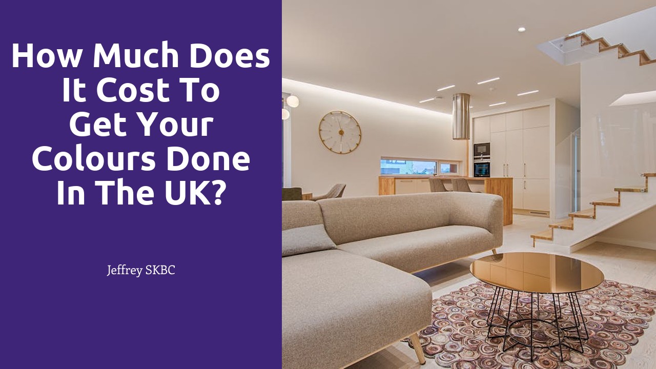
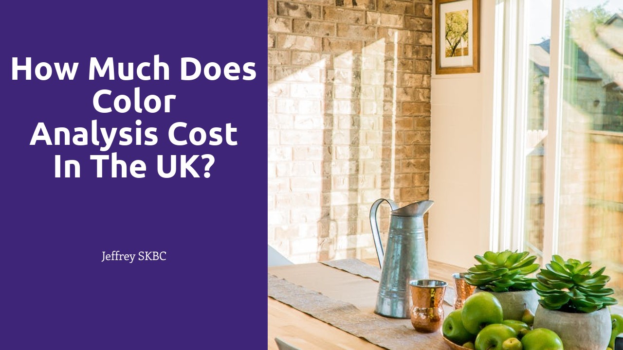
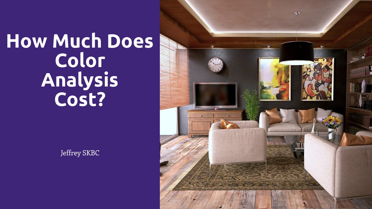
Jeffrey SKBC provides a top-notch Color Consultation service to help clients choose the perfect colour scheme for their projects. Whether it's selecting paint colours for a room in a home or choosing the right shades for a commercial space, our experienced team is here to help. Our colour consultants take into consideration factors such as lighting, décor, and personal preference to ensure that the final result exceeds our client's expectations. With Jeffrey SKBC, you can trust that your colour consultation will be tailored to your unique needs and style.
Common Mistakes to Avoid During a Colour Consultation
When engaging in a color consultation for a space, it is crucial to avoid the mistake of solely focusing on individual colors without considering how various finishes will interact with them. Overlooking the impact of finishes like matte, glossy, or textured surfaces can lead to a mismatched and unbalanced aesthetic in the design. It is essential to analyze how different finishes will reflect light and affect the overall perception of the chosen colors within the space.
Another common mistake during a color consultation is neglecting the principles of color psychology in interior design. Colors have the power to evoke specific emotions and moods, so failing to consider this aspect can result in a space that does not reflect the desired atmosphere. By understanding the basics of color psychology and how different hues can influence feelings and behaviors, designers can create harmonious and inviting environments that resonate with the occupants.
Overlooking the Impact of Finishes
Many individuals tend to underestimate the significance of finishes when considering a color consultation for their spaces. However, finishes play a crucial role in how colors are perceived and can greatly impact the overall aesthetic and ambiance of a room. Whether opting for glossy, matte, or textured finishes, each choice can alter the way colors interact with light and space.
For instance, a matte finish tends to absorb more light, resulting in a softer and more muted appearance of the chosen color. On the other hand, a glossy finish reflects light, creating a vibrant and sleek effect. Textured finishes add depth and dimension to a color, transforming the visual experience within a room. By overlooking the impact of finishes during a color consultation, one may miss out on the opportunity to fully enhance the chosen color palette and achieve the desired look and feel of the space.
The Impact of Colour Psychology in Interior Design
Color psychology plays a crucial role in interior design, influencing the emotions and perceptions of individuals within a space. When selecting colors for a room, it is essential to consider the psychological impact they may have on the occupants. For instance, warm tones like red and orange can evoke feelings of energy and excitement, making them ideal for social areas like living rooms or dining spaces. On the other hand, cool hues such as blue and green are known to promote relaxation and tranquility, making them suitable for bedrooms or meditation areas.
Moreover, different colors can also affect the perception of space within a room. Darker shades tend to make a space feel cozy and intimate, while lighter tones create an illusion of openness and airiness. By understanding the impact of color psychology, interior designers can strategically use colors to enhance the functionality and ambiance of a space, creating a harmonious environment that meets the emotional needs of the occupants.
Creating the Desired Atmosphere
Creating the desired atmosphere in a space is key to achieving a harmonious and pleasing environment. When selecting colours for a room, it is crucial to consider the overall mood and ambiance you wish to evoke. For instance, lighter shades like soft blues and greens can create a sense of tranquility and serenity, perfect for bedrooms or relaxation areas. In contrast, bold colours such as deep reds or vibrant yellows can inject energy and dynamism into social spaces like dining rooms or living rooms.
In addition to colour selection, the use of lighting can also greatly influence the atmosphere of a room. Natural light promotes a feeling of openness and freshness, while warm artificial lighting can create a cozy and inviting atmosphere. By combining the right colours with appropriate lighting choices, you can tailor the ambiance of a room to suit its intended purpose and enhance the overall experience for anyone who enters the space.
Trends in Colour Consultation for 2021
2021 is embracing a range of nature-inspired hues that bring a sense of serenity and tranquility to interior spaces. From earthy greens to calming blues, incorporating these colors can create a harmonious and comfortable environment in your home. These nature-inspired tones not only add a touch of freshness but also connect us to the beauty of the outdoors, making our living spaces more inviting and relaxing.
Another trend to watch out for in colour consultation this year is the rise of warm neutrals and comforting pastels. Soft shades like blush pink, sandy beige, and pale peach are making a comeback, bringing a sense of warmth and coziness to any room. These gentle hues can add a subtle touch of elegance and sophistication to your living space, creating a soothing atmosphere that promotes relaxation and well-being.
Incorporating Natureinspired Hues
When it comes to incorporating nature-inspired hues into your colour consultation, it's essential to draw inspiration from the great outdoors. Think about the serene greens of lush forests, the calming blues of flowing rivers, and the warm earthy tones of sandy beaches. By harnessing these natural colours, you can bring a sense of tranquility and harmony to any space in your home.
Nature-inspired hues can also evoke specific emotions and moods in a room. For instance, soft shades of green can promote relaxation and rejuvenation, perfect for bedrooms or reading nooks. On the other hand, warm tones of gold and brown can create a cozy and welcoming atmosphere in living rooms or dining areas. By carefully selecting and combining nature-inspired hues, you can transform your space into a peaceful retreat that connects you with the beauty of the natural world.
FAQS
What is a colour consultation?
A colour consultation is a service provided by interior designers or colour experts to help individuals or businesses choose the perfect colour scheme for their space.
Why is a colour consultation important?
A colour consultation is important because the right colours can greatly impact the look and feel of a space, affecting mood, productivity, and even health.
How can I prepare for a colour consultation?
Before a colour consultation, you can gather inspiration images, fabric swatches, and any other items that reflect your desired colour scheme or style preferences.
How long does a typical colour consultation last?
A typical colour consultation can last anywhere from one to three hours, depending on the size of the project and the level of detail required.
What are some common mistakes to avoid during a colour consultation?
Common mistakes to avoid during a colour consultation include overlooking the impact of finishes, disregarding colour psychology, and not considering current trends in colour consultation.